iOS - the most mature mobile business platform
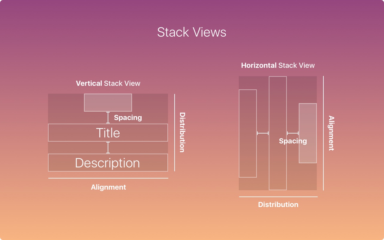
iOS has evolved a lot over the years. In the latest upgrade, Apple introduced a new system font called San Francisco, 3D Touch and multitasking on the iPad. In Xcode, you will find Stack Views, This is a great tool to make your layout more adaptable without the complexity of automatic layout. Apple is more than ever encouraging responsive layouts so your design can run on multiple devices.
Adaptive layout and multitasking
With the device to be processed for Resolution higher and higher,Making layout adaptive is critical. With tools like Sketch Constraints or Xcode, you have to design in a flexible screen size and display additional menus when needed.
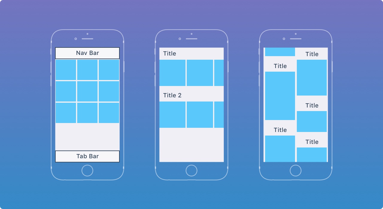
Here's how the layout fits from iPhone to iPad Pro. User interface extensions rather than extensions. For larger screens in landscape mode (such as iPad and iPhone X Plus), the left navigation is displayed instead of the tab bar.
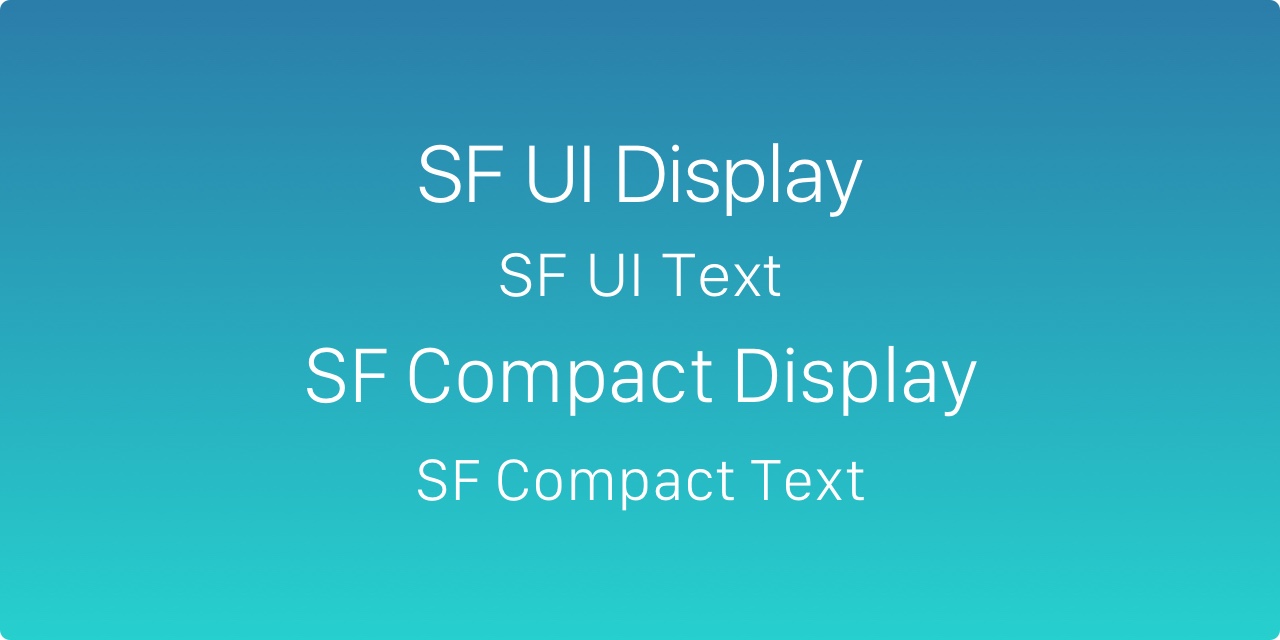
SF Font
The default font is now a San Francisco font, made by Apple internally. I encourage you to watchVideo ,Learn how it affects the design of iOS.
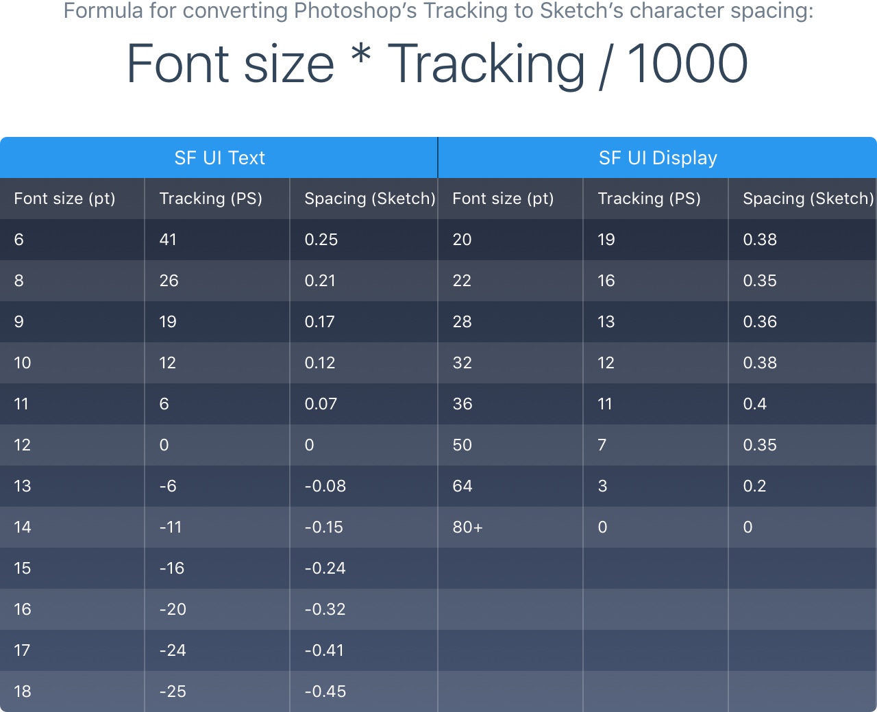
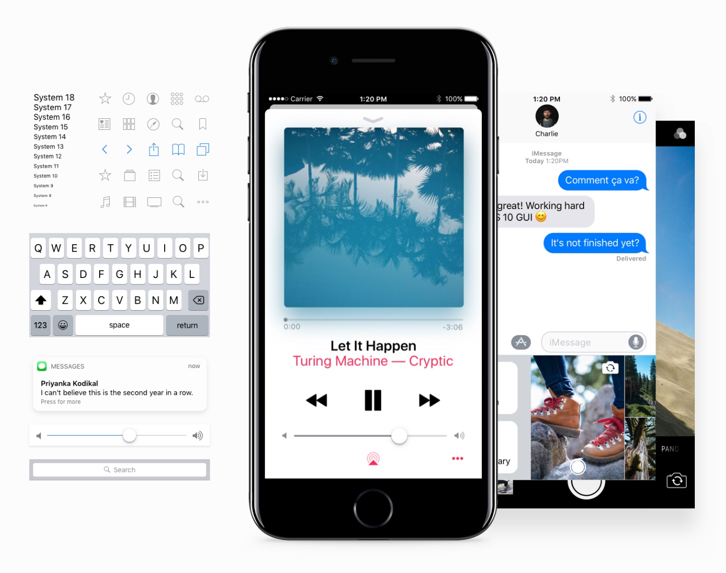
SF Font Tracking
iOS automatically adjusts the tracking value and San Francisco text/display based on the font size. This ensures that the font is always easy to read. At 20 lbs or higher, the SF UI should be used, otherwise SF UI text is used. These tracking values can only be applied in Photoshop, but this is the formula that is converted in Sketch.
UseSketch PluginQuickly apply the correct character spacing value.
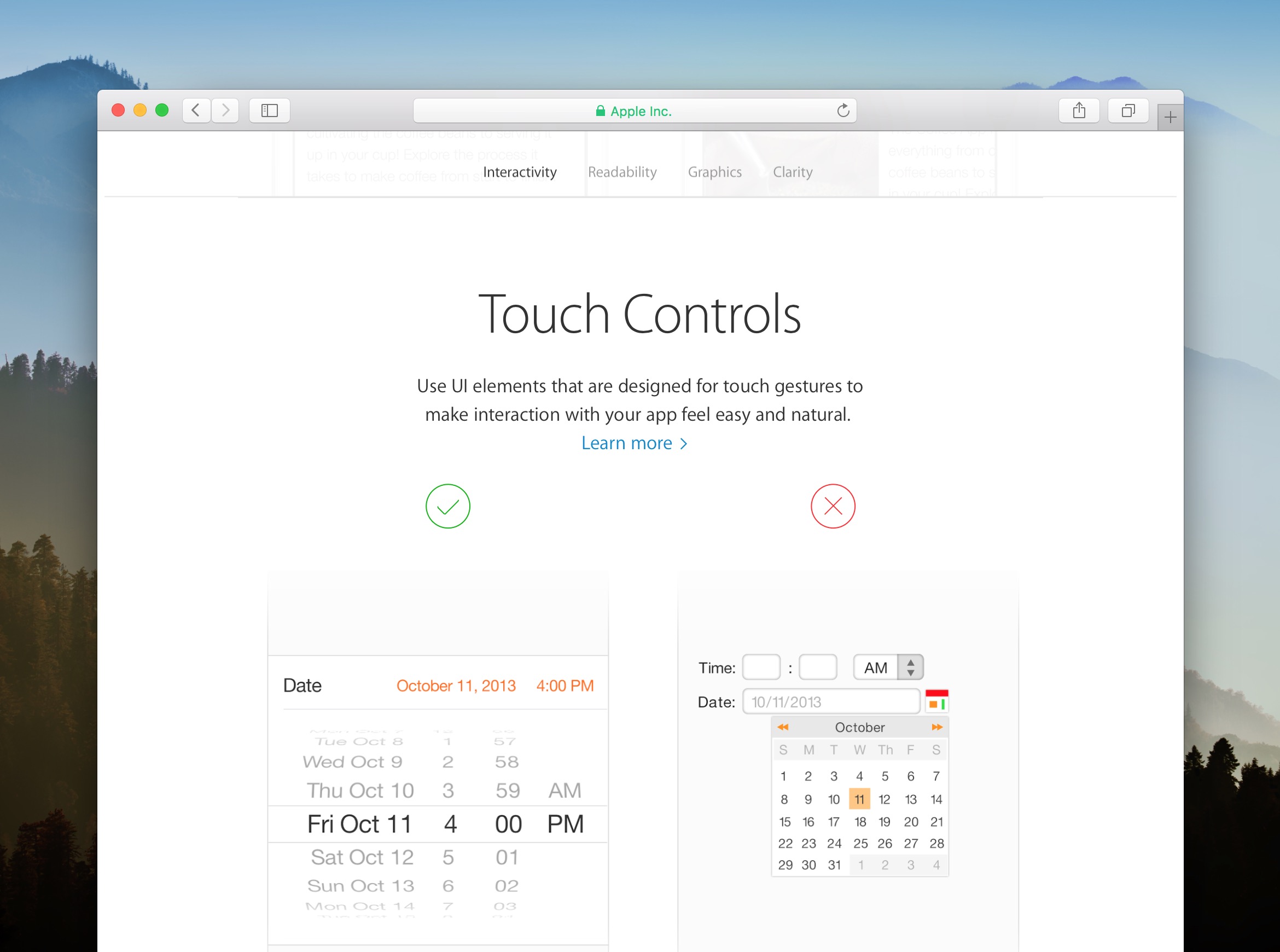
3D Touch
An important new feature in iOS is called 3D Touch, which allows users to quickly access options inside and outside the app.
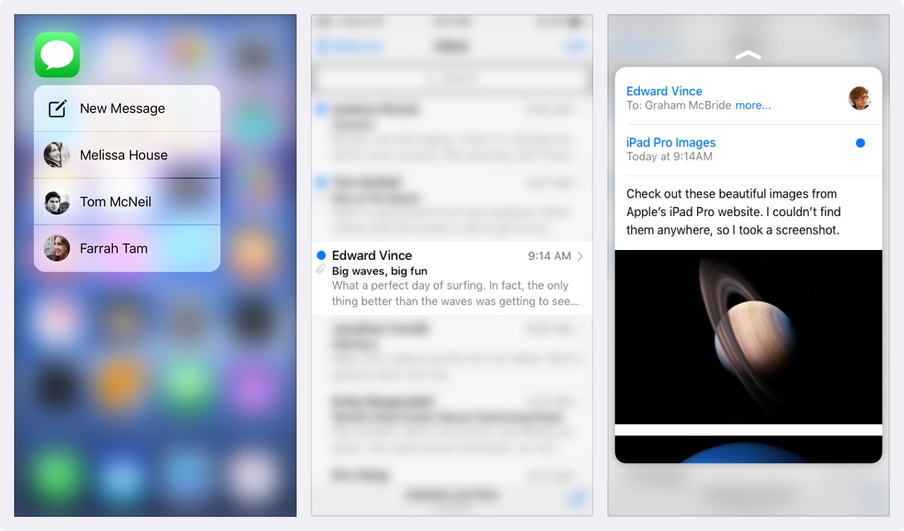
Users can now press your app icon and find frequently used items. Inside the app, you can preview the message and preview the link before going full screen.
Think of 3D Touch as a keyboard shortcut on your Mac - they enable people to do repetitive tasks faster. You must design shortcuts to increase the productivity of advanced users. But like keyboard shortcuts, basic functionality shouldn't be unique to 3D Touch. Without it, your users must be able to operate your application properly.
Point and Pixel
Developers use point values, so it's important to understand the difference in pixels. When the iPhone first debuted, the two units were the same: 1pt equals 1px. Then when the retina screen appears, 1pt becomes 2px. Therefore, treat the point as a value in the original iPhone and treat the pixel as the actual value, depending on the pixel density (iPhone 4, 5, 6 = @ 2x, iPhone 8 Plus = @ 3x).
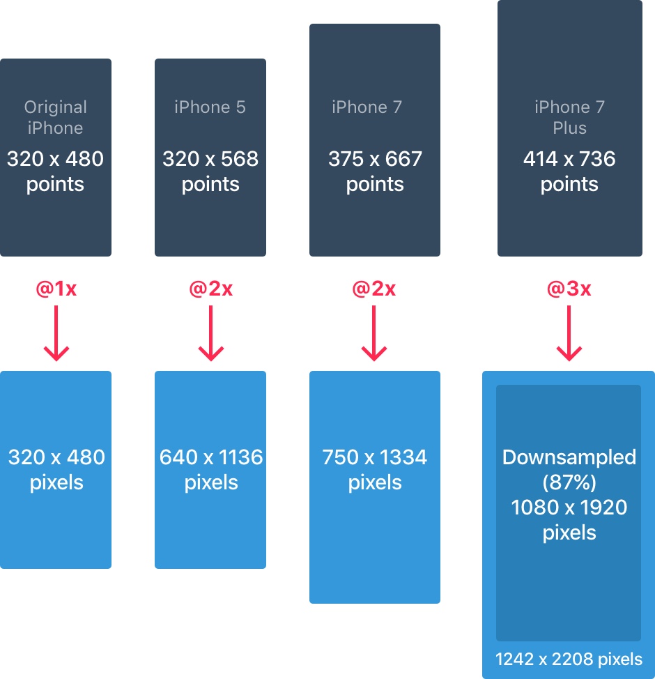
For more information, please check thisguide
iPhone Resolution
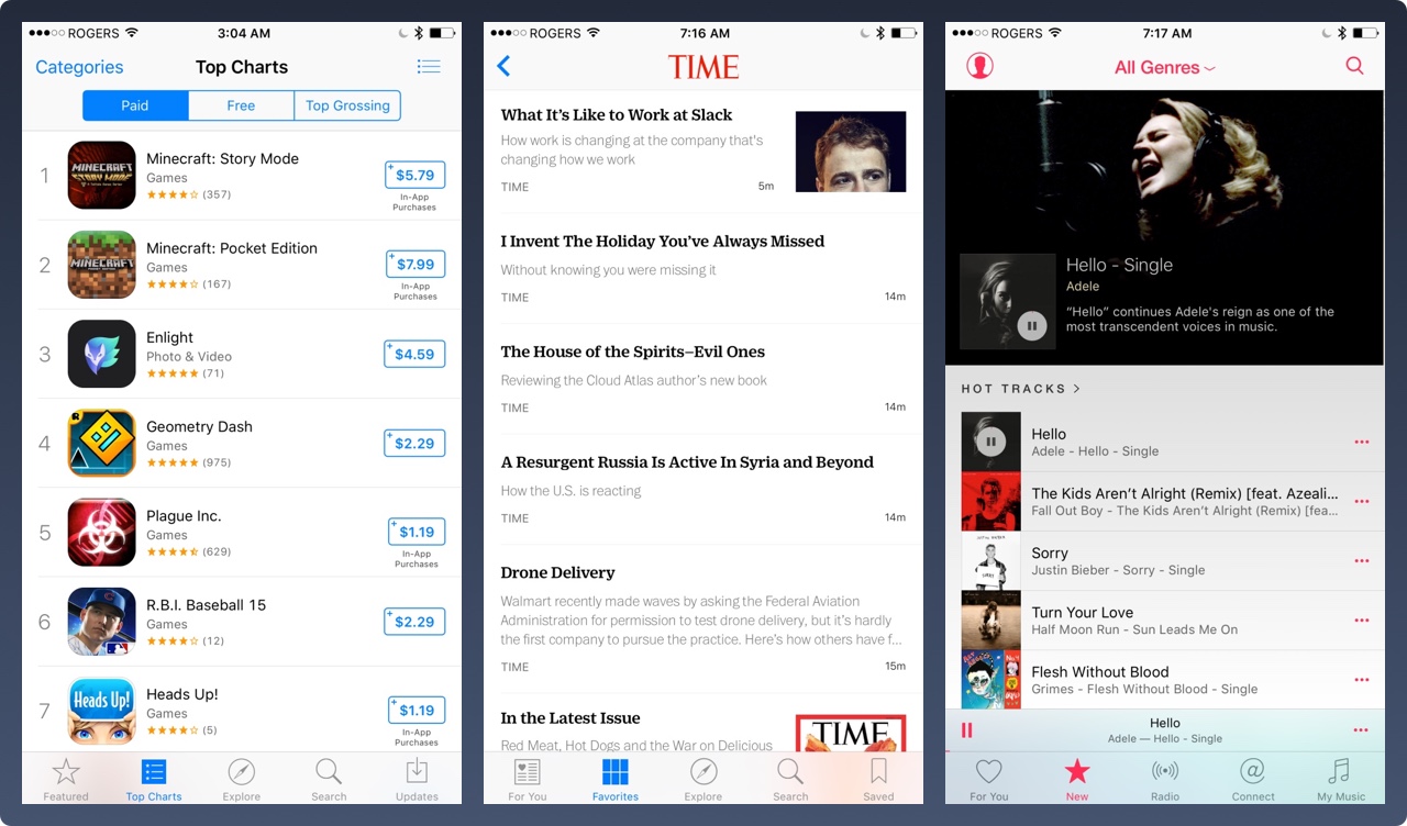
The iPhone has 4 main resolutions: 320 x 480 pt (iPhone 4), 320 x 568 pt (iPhone 5), 375 x 667 pt (iPhone 7) and 414 x 736 pt (iPhone 7 Plus). The layout does not scale, but it scales according to the resolution. For example, the navigation bar only adjusts the width but maintains the same height. The elements inside remain intact.
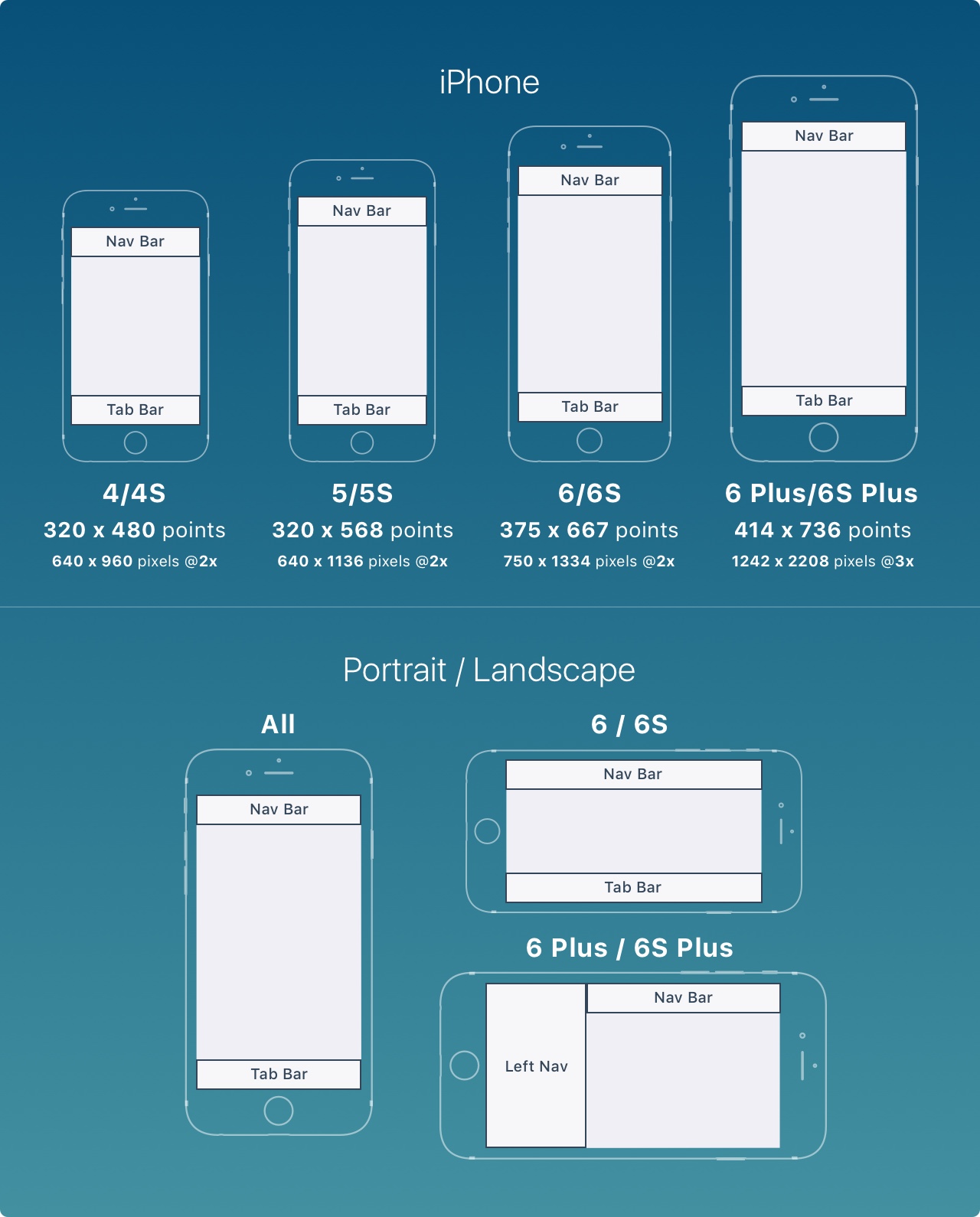
The iPhone 7 Plus is the only iPhone that is more like an iPad in landscape mode. In other words, the left navigation will appear, replacing the need for the Tab key.
iPad Resolution
The iPad has 2 main resolutions: 768 x 1024 pt (iPad), 1024 x 1366 pt (iPad Pro).
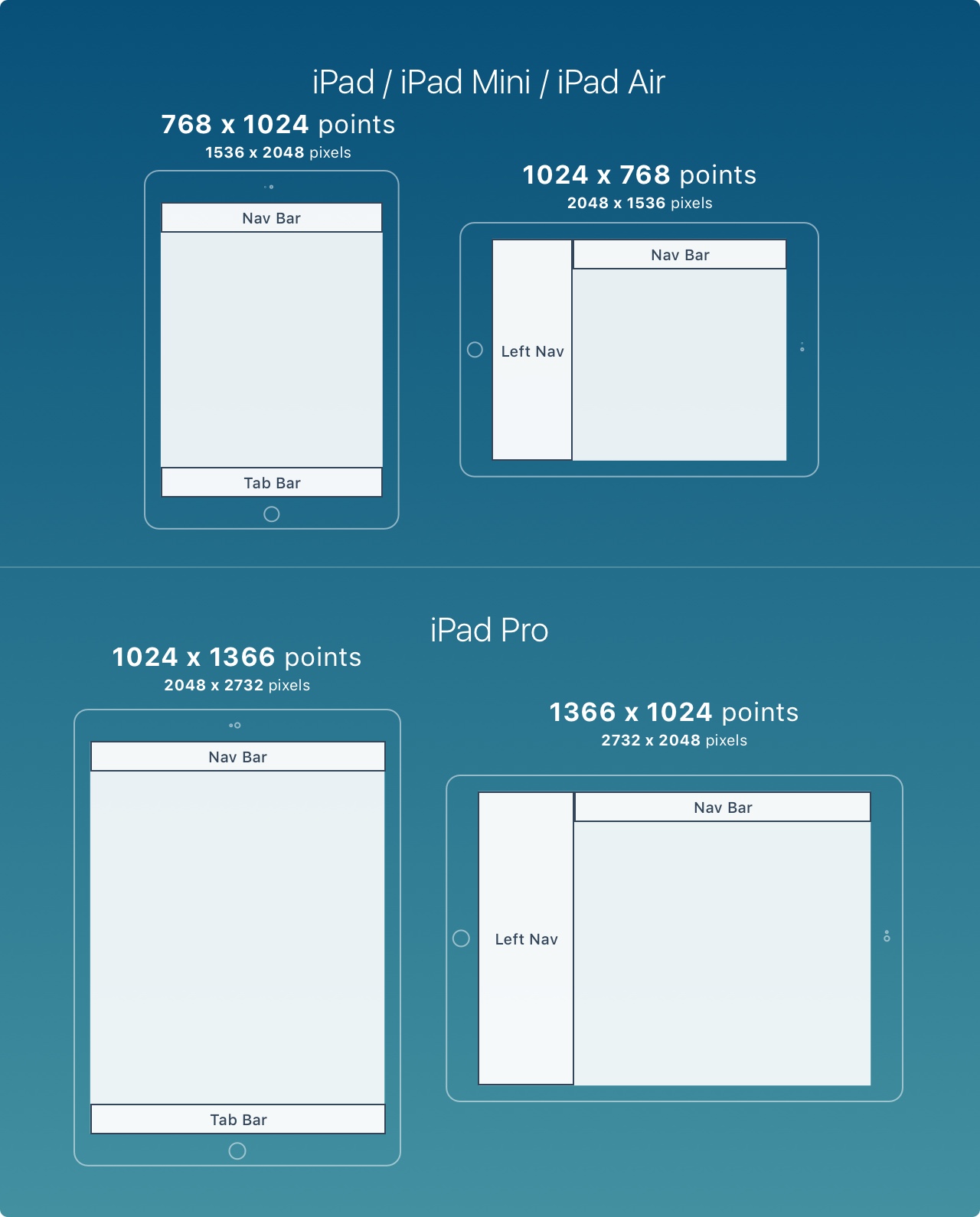
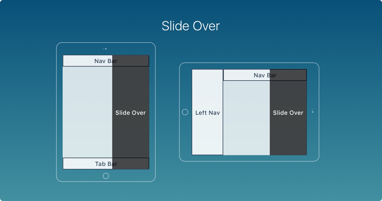
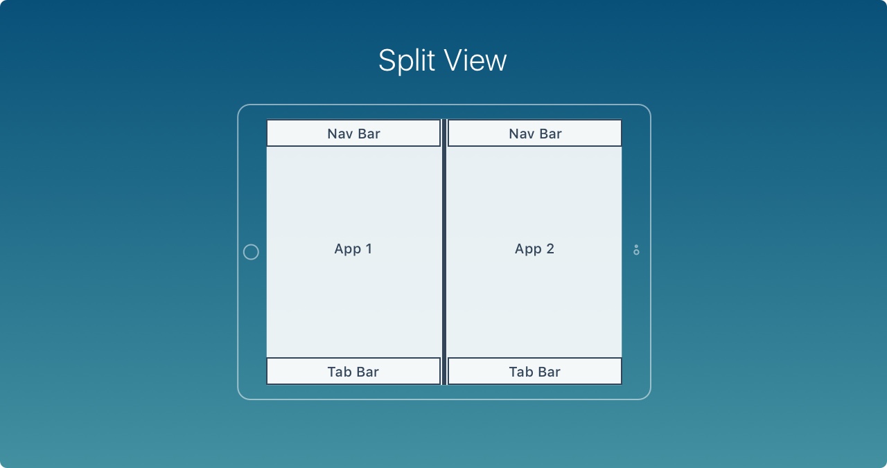
The iPad has 2 new features: Slide Over and Split View. Slide Over Is an overlay that is displayed on the right side of the screen and does not affect the layout of the current application.
Split view allows users to perform multitasking by running 2 applications simultaneously in portrait mode
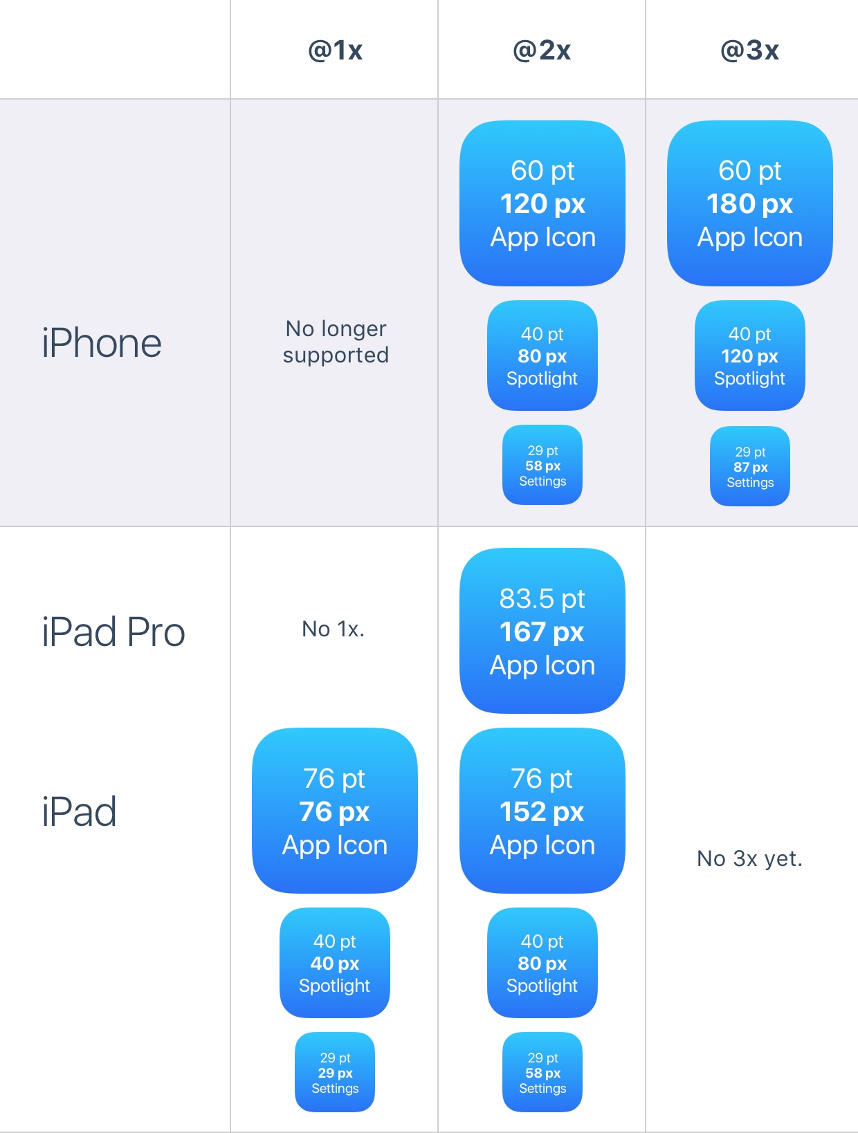
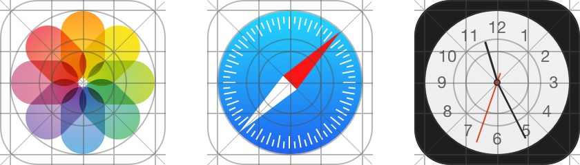
App Icon
The app icon is used for branding of the app. This is what the user first saw when they experienced it. It stands out in the main screen App Store in Spotlight and Settings.
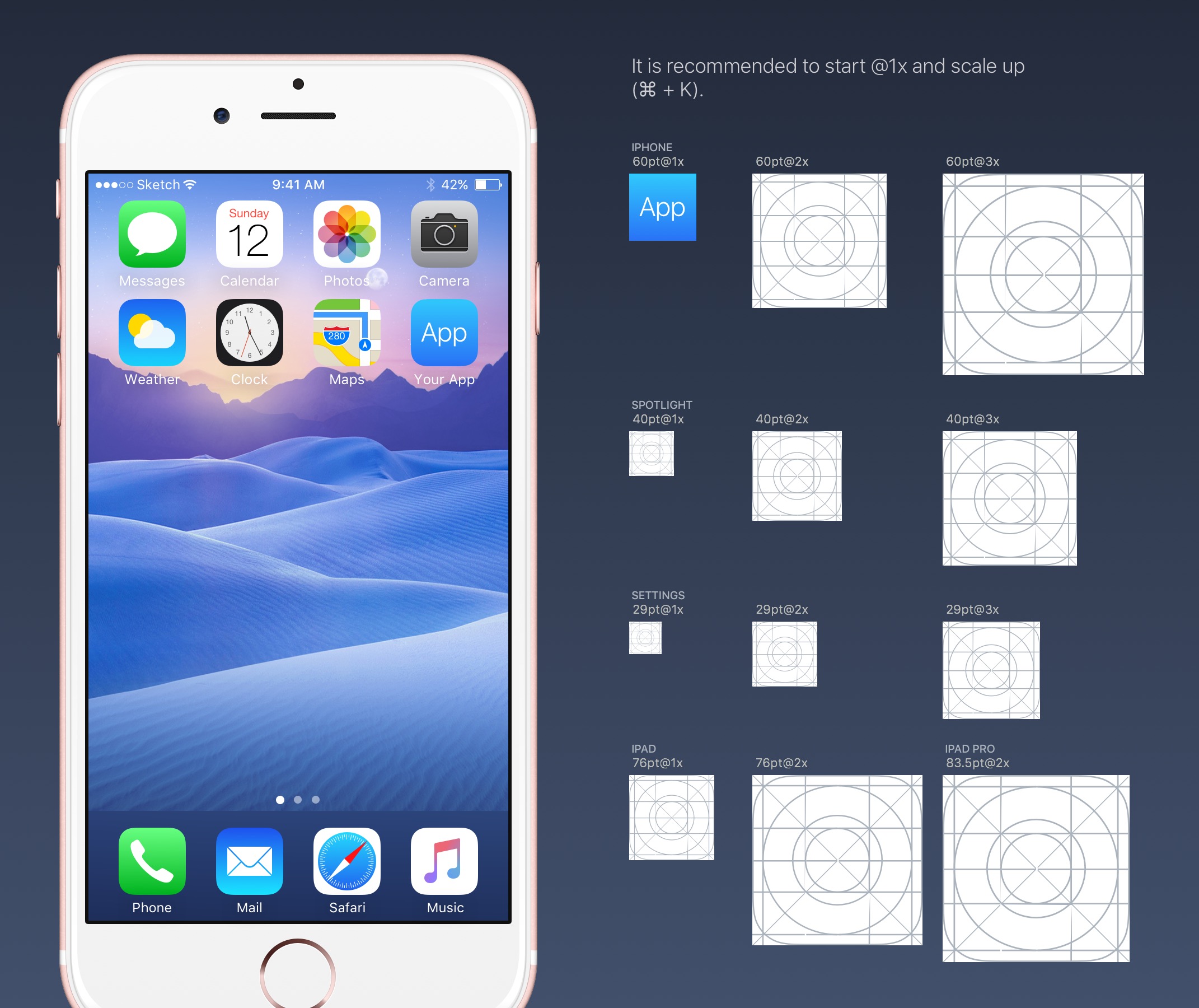
The iPhone no longer supports the @1x format, so you don't need to generate them. The application icon now has 2 resolutions: @ 2x and @ 3x. There are 3 types: app icons, spotlights and settings. For iPad, use @1x and @2x.
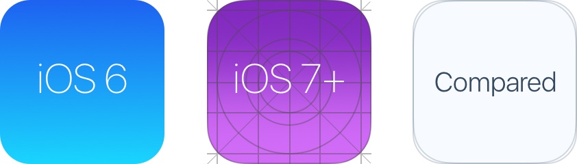
Ellipse
Starting with iOS 7, the fillet has changed from a flat fillet to a super ellipse. Be careful not to use the mask export icon, otherwise you may find black artifacts. Instead, just export the square asset to the App Store.
Grid Icon
Apple applied a golden ratio on some of their icons. This ensures that the icon is perfect while maintaining a good ratio. Although this is a good rule, it is not a strict rule. Even Apple has omitted it on many icons.
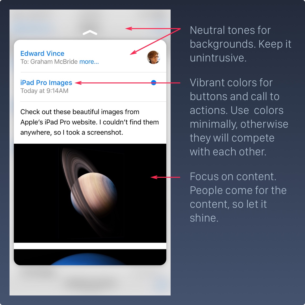
Color
iOS uses bright colors to display buttons. These colors tend to be as good as a black background on a white background. Keep in mind that colors should be sparsely used for call-to-action and minimal branding areas, such as navigation bars. Roughly speaking, only 10-20% of designs should have color, otherwise they will compete too much with content.
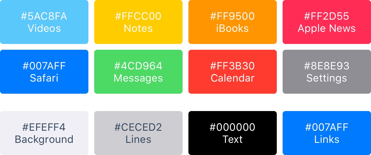
iOS usually uses neutral colors as the background and menu area. Use text that contrasts sharply with the white background to make the text comfortable to read. Finally, the soft blue is used to make the button stand out.
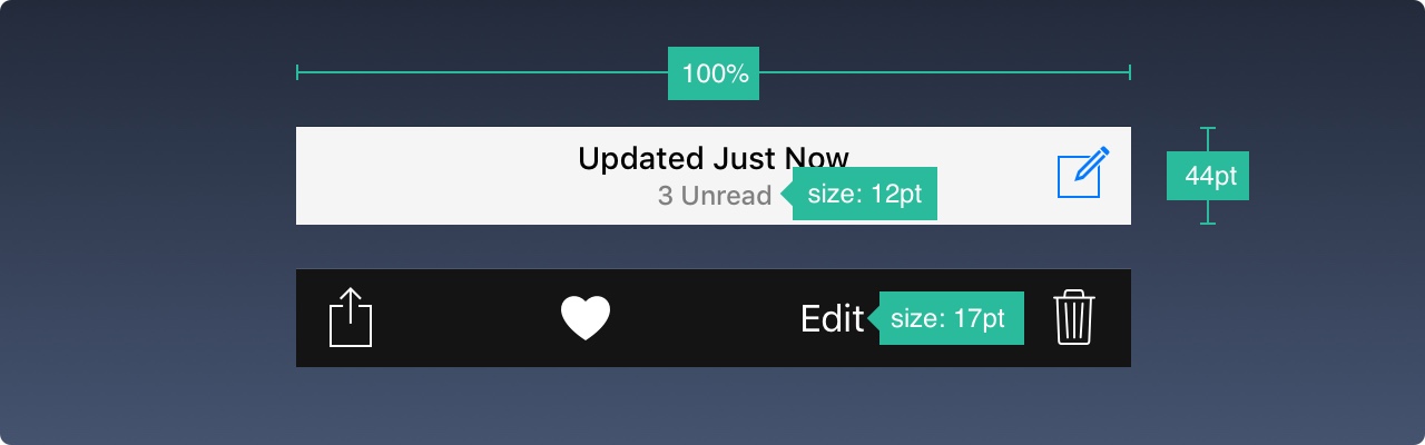
Button and Font size
The general rule is that the button is44pt,12pt Small text, 17pt Paragraph, 20pt+ Title
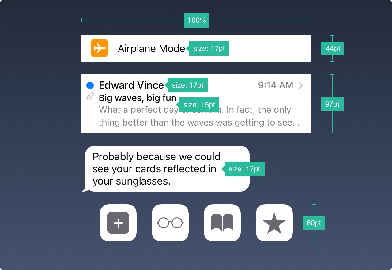
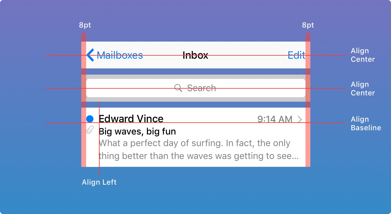
Spacing and alignment
The general rule for the minimum padding is8pt. This creates enough breathing space, which makes the layout easier to scan and the text more readable. In addition, the UI elements should be aligned and the text should have the same baseline position.
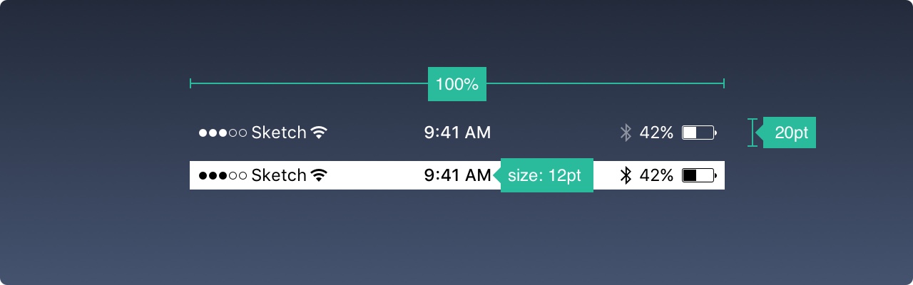
Status Bar
It is recommended to include the status bar in as many places as possible. Users rely on it to get important information such as signals, time and battery. Text and icons can be white or black, but the background can be customized to any color and merged with the navigation bar.
Navigation Bar
The navigation bar is used to quickly understand the screen information. The left part can be used to place the "Back", "Profile", "Menu" buttons, while the right part is usually used for "Add", "Edit", "Complete" and other operation buttons. Note that if you use any of these system icons, you don't need to create assets for them.
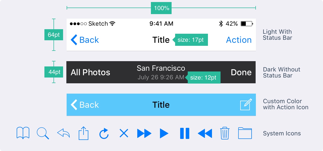
Just like the status bar, the background can be customized to any color and usually has subtle blurring to ensure that the text is always readable. When the status bar is present, both backgrounds are merged.
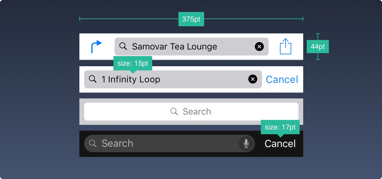
Search Bar
If you have a lot of content, it's wise to make it searchable.
Tool Bar
You will need to use the toolbar when you need more space to place the action buttons and screen status.
Tab Bar
The tab bar is the primary navigation between multiple screens. If you have to show very few thingsPlease avoid the folding menu.
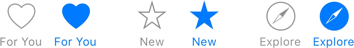
When they are not selected, the icon usually has an outline instead of a fill. Like this, they attract less attention.
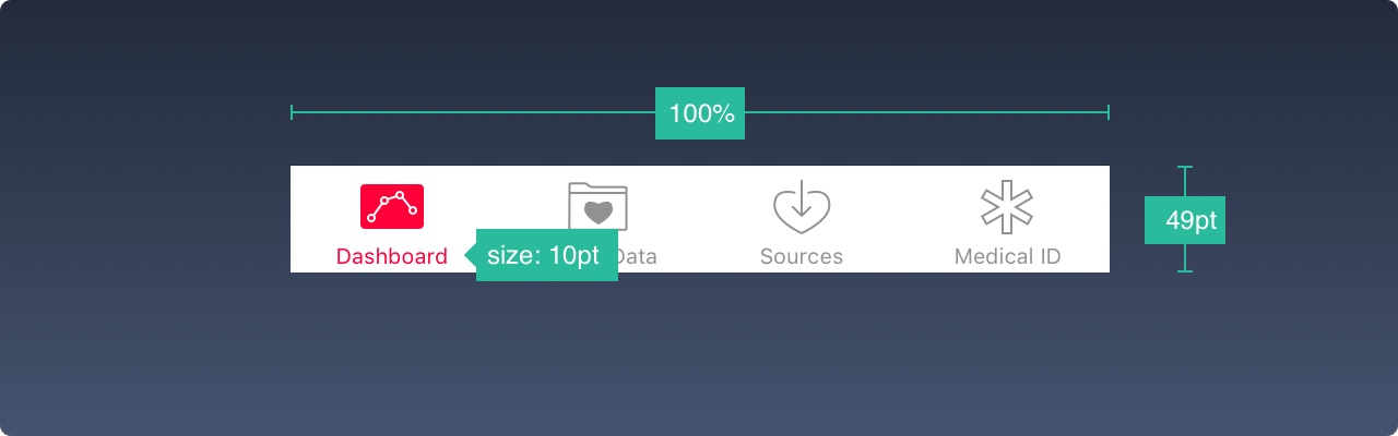
Table View
The table view is a very common user interface for listing content. Most applications use the form of a table view. This is because it can be very basic or can be highly customized to the smallest element.
At the base level, you can use many preset styles and attachments.
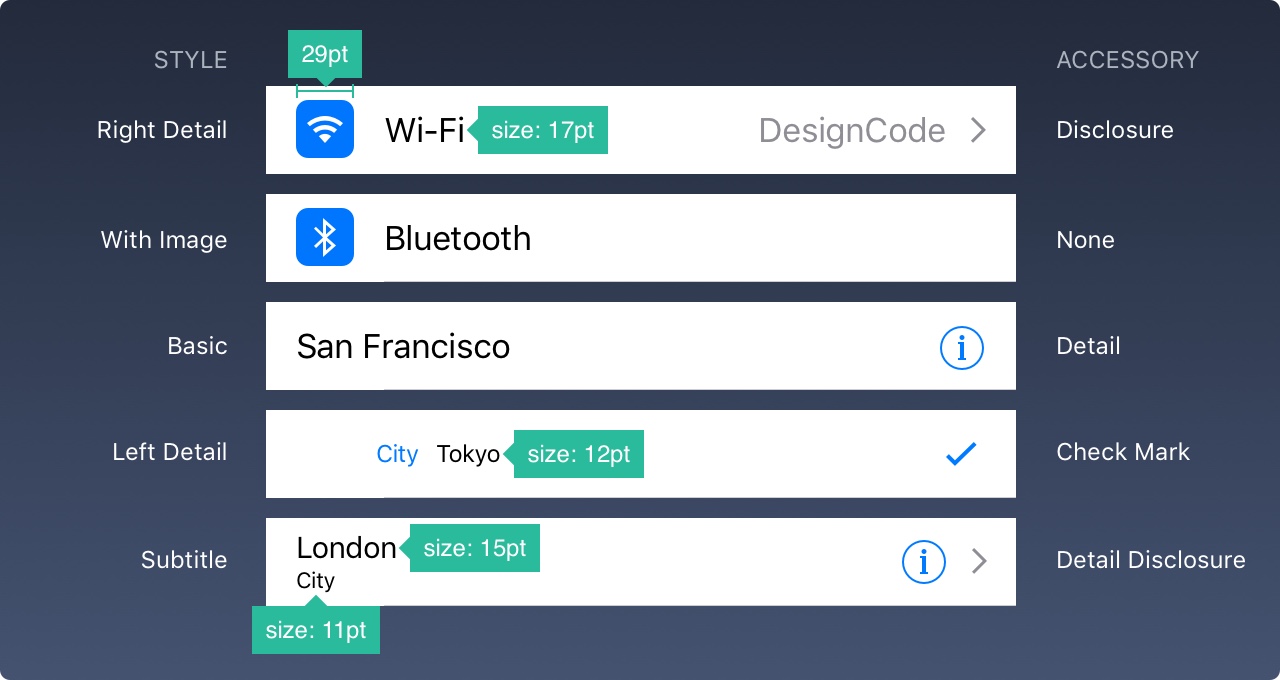
Cells can also be grouped with a title on it, as described below.
Collection View
If the grid style contains rows and columns, you need a Collection View. Although more advanced, it can create almost any layout you've always dreamed of.
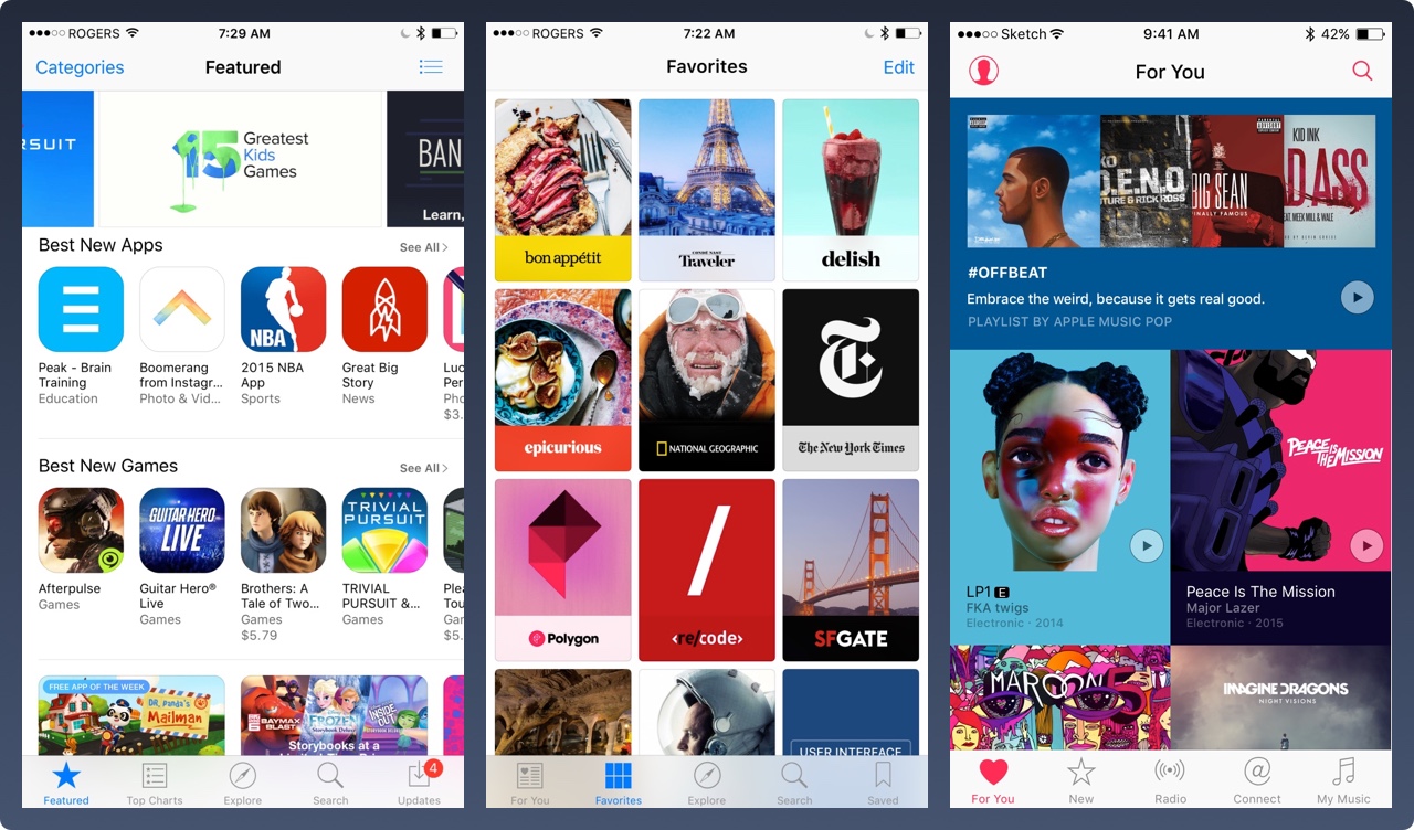
The collection view layout may look like these, or a combination of them. The possibilities are endless.
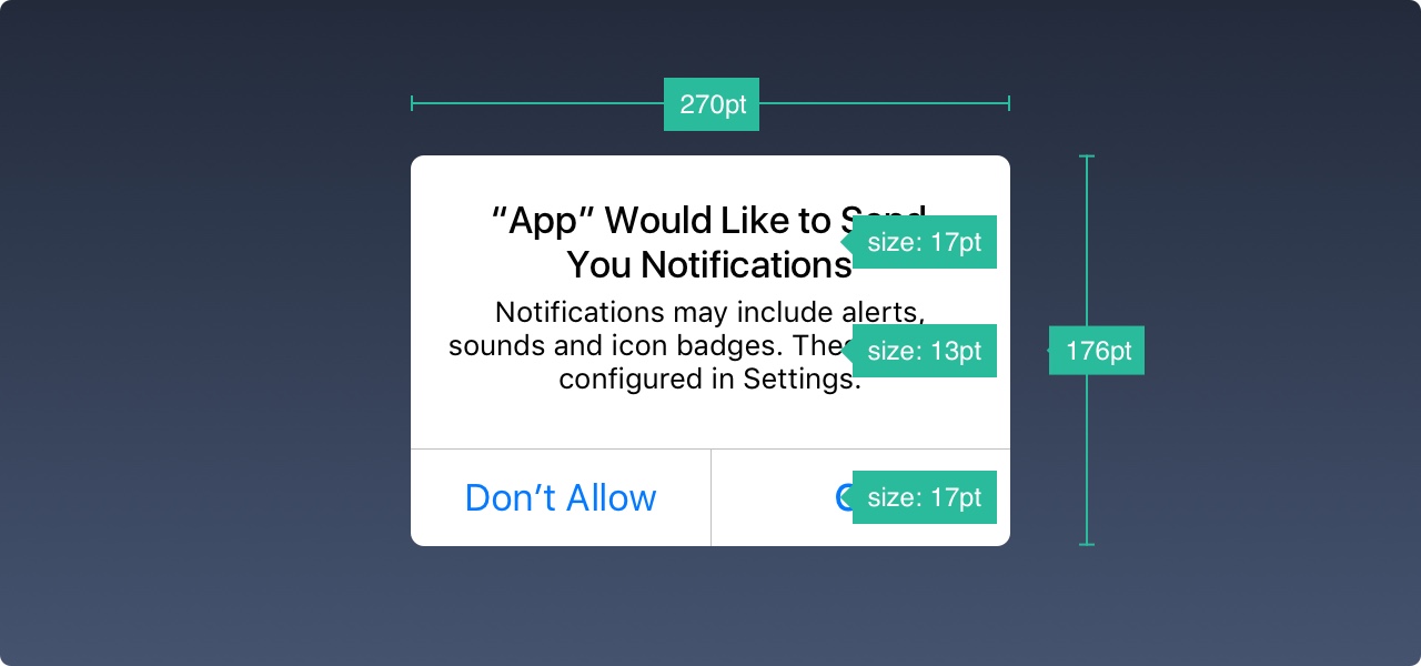
Modals
ReminderDialogs are used to convey key information and prompt for quick action. Reminders should be kept to a minimum and exits must be obvious.
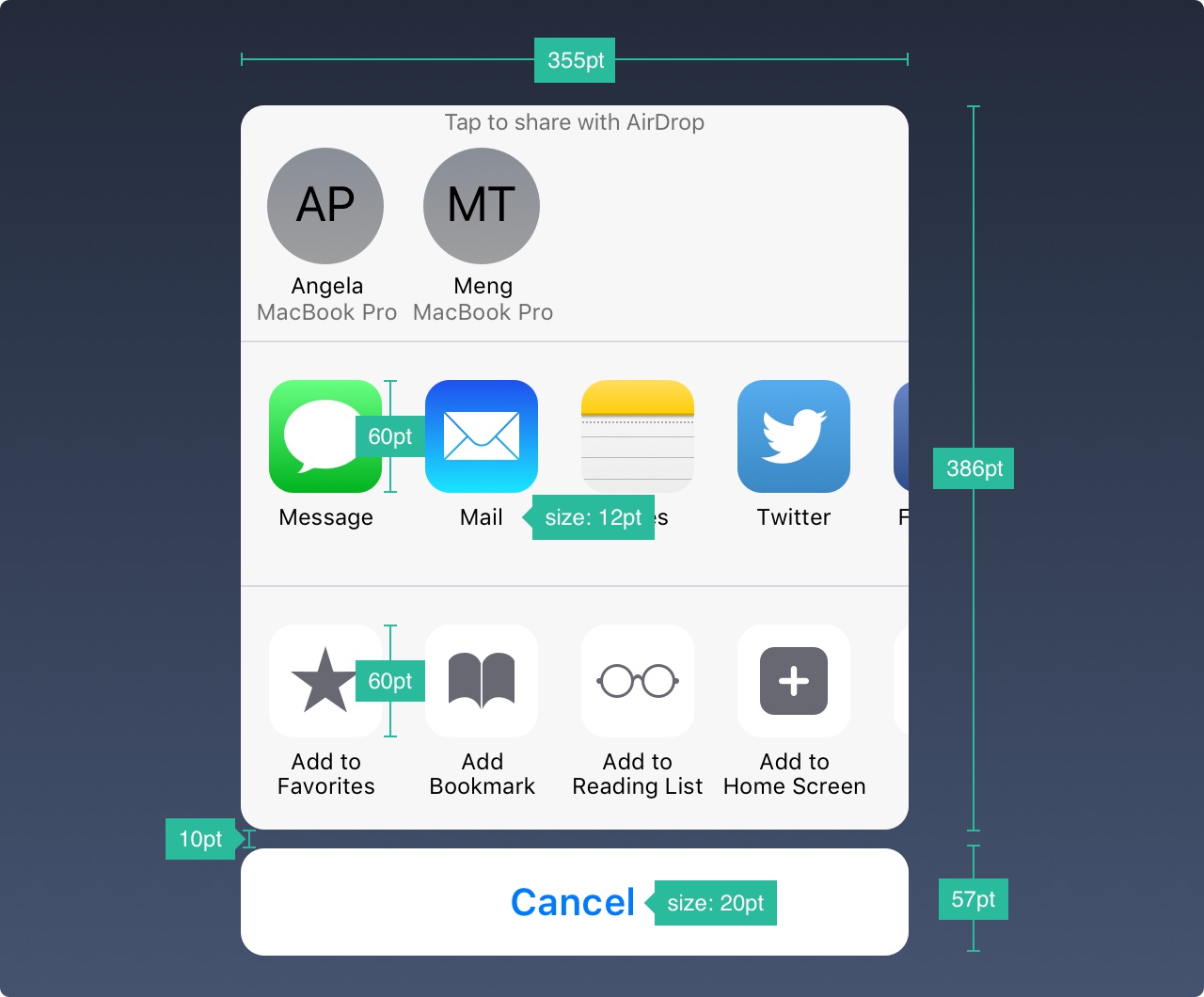
ActivityThe dialog allows you to share iOS-enabled content (text, images, links) such as Airdrop, Favorites, Bookmarks, and Mail, Facebook, Twitter and more. Although the look can't be customized, the options are.
When the information displayed is not short, you can design a full-size modal, usually in slides, fades, flips or page animations. Like other modalities, it must be easy to cancel and as short as possible.
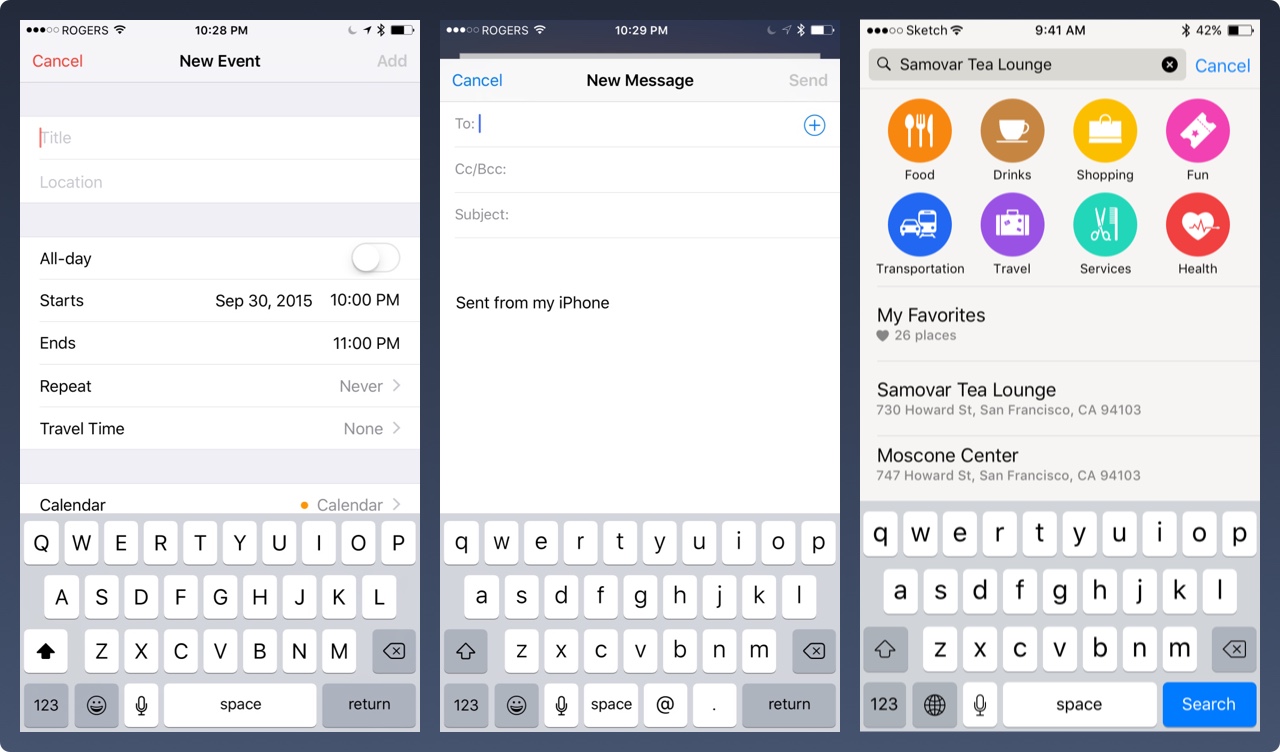
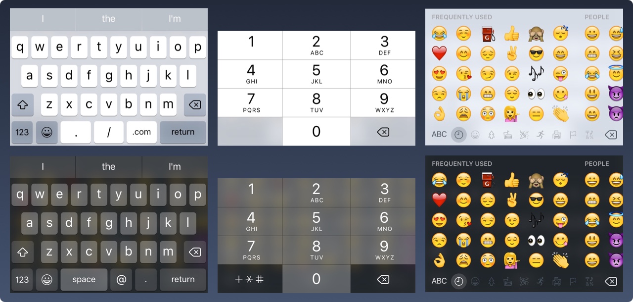
Keyboard
The keyboard is used to enter information in a text field, such as search, chat, or login. It is highly customizable and works with URLs, emails, phone numbers and even emoji. You can choose between Light and Dark themes and how to name the action buttons (return is the default).
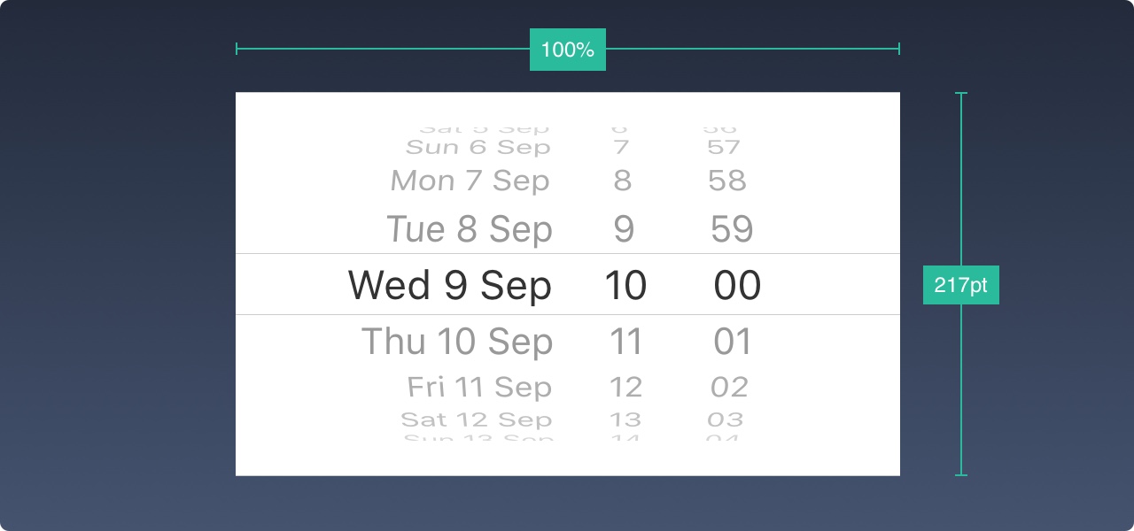
Picker
If you have multiple options to choose from, you can use the Picker control. It is especially useful for dates, which control 3 fields in an action.
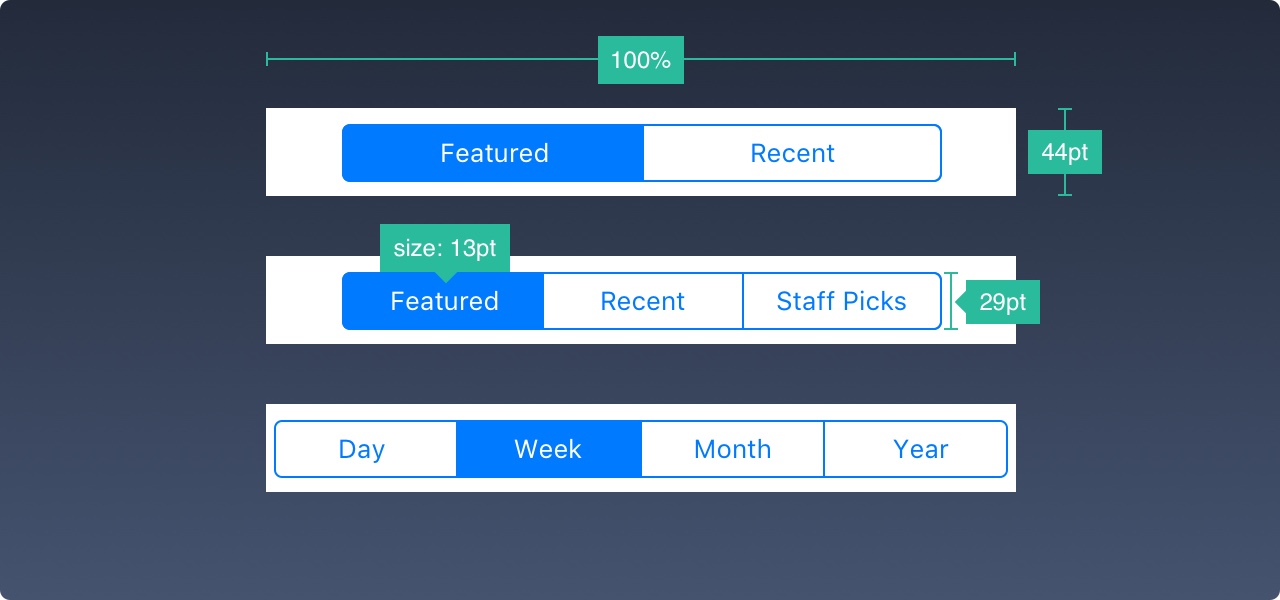
Segmented Control
When the tab bar navigates to the main section, the segmentation control is used for the subsection.
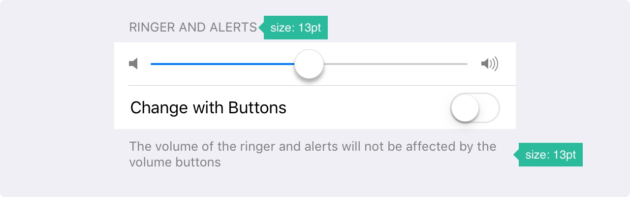
Sliders
Sliders are less precise interactive controls, but are useful for quick setups such as sound, brightness, and video progress.

Progress
The progress bar is an indicator of how far the activity has gone. For example, you can use it to display the loading progress of a web view. Please note that the height can be customized.

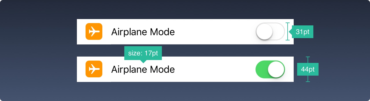
Switch
Use this option to quickly switch between on and off. Do not use it for any other purpose except on/off.
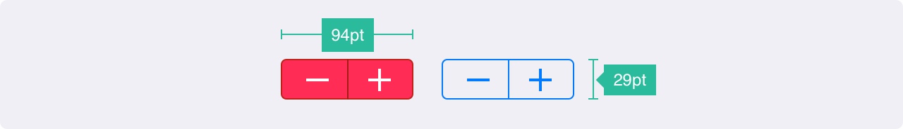
Stepper
The Stepper is slower but more precise than the Slider, allowing the user to increase or decrease a value in increments of one. The border and background can be customized.
iOS Icon
These are native icons that penetrate iOS. Because they are commonly used, users can immediately recognize their meaning. Using them for other purposes can be confusing to your users, so it's important to understand how they are used in iOS.
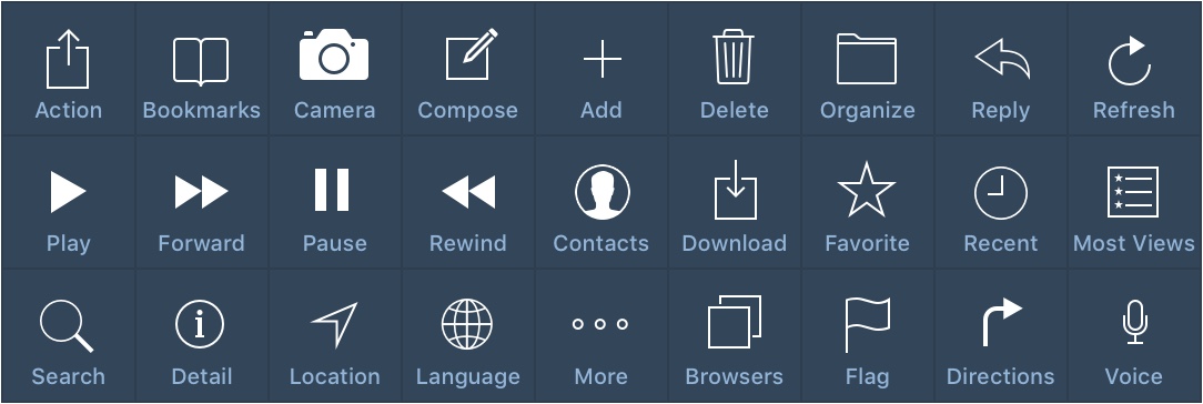
When designing custom icons outside of these, it is important to use well-known symbols. In addition, I strongly recommend that they carry small texts of 10pt or longer.
Resource
These templates are not only for learning, but also for reuse and customization, so you don't have to start from scratch. As you become more familiar with them, you will be able to gain creativity.
iOS 11 GUI for iPhone
If you're designing for iOS, you'll need to use prefab elements such as status, navigation, and tab bar. Adapt to all colors, sizes, fonts and components.
iPad GUI
The new iPad UI kit includes iPad Pro devices and keyboards in portrait and landscape modes. Everything is in the vector.
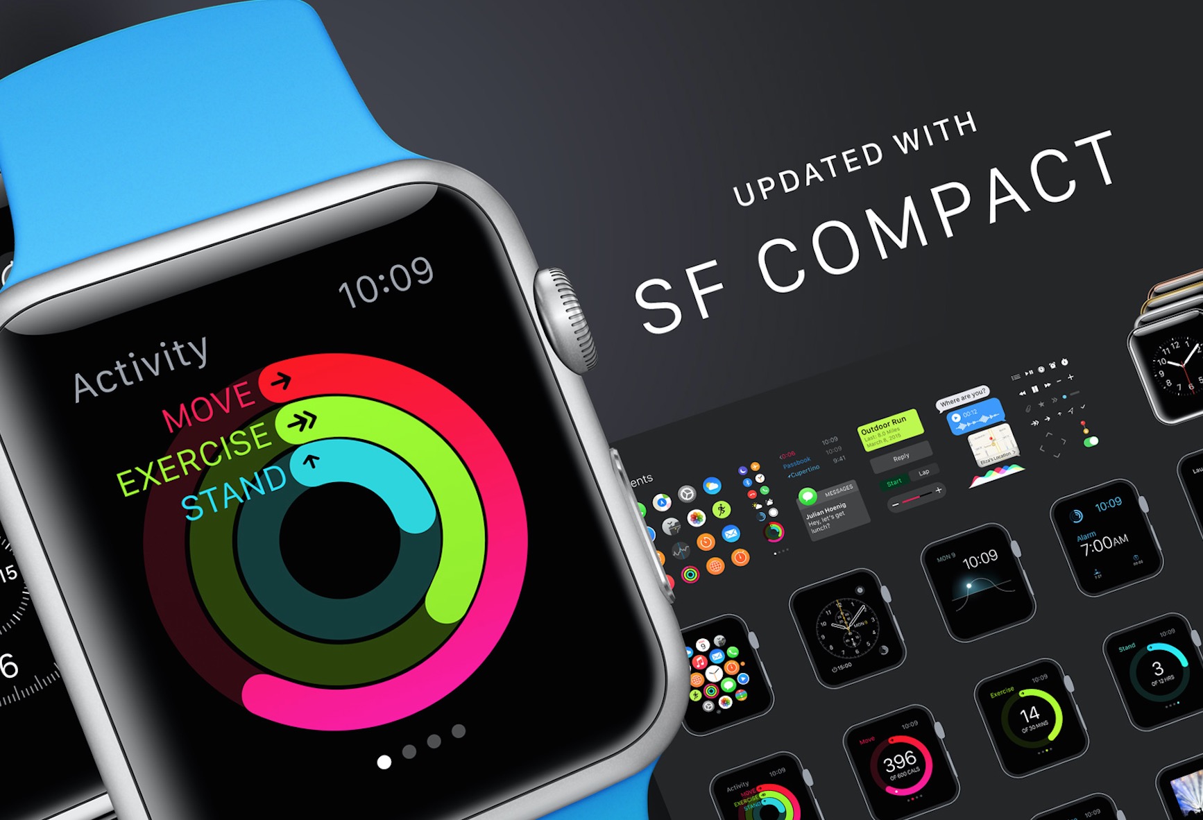
Apple Watch GUI
Apple Watch is a very complete UI toolkit, including Apple Watch devices, vector icons and clocks. You can resize and export them at any resolution.
UI design considerations
Some practices should be avoided at all costs, especially if you are new to iOS. Please follow the simple examples presented by Apple.
Apple's iOS Human Interface Guide
Apple's advanced and basic reading materials iBooks download
Program Syllabus
- Program Date and Time
- 08/03/2019
Program Kickoff
- Program Duration
- 2.5 hours for each checkpoint, 30 hours in total
- Prerequisites
- Experienced in any programming language(e.g. Java, C, Python)
- Program instruction
- Live Broadcast, students must be on time. (there is no refund for missing any lesson)
Who should take this course
For students who has no professional IT background, or just getting into IT study
Want to get your first job in IT company, but don't know how to prepare for interview
don't know where to start, even there are thousands of courses online...
don't know how to communicate with interviewers or struggling in technical interviews
Want to get the most updated interview questions and mocks
Program Structure
| Week | Content | Melbourne Time | Sydney Time |
|---|---|---|---|
| 1 | Swift - A Modern Multi-purpose Language | 2019/08/03 20:00:00 | 2019/08/03 20:00:00 |
| 2 | Swift - Protocol Oriented Programming | 2019/08/10 20:00:00 | 2019/08/10 20:00:00 |
| 3 | iOS Industry Project Bootstrap | 2019/08/17 22:00:00 | 2019/08/17 20:00:00 |
| 4 | iOS Industry Project | 2019/08/24 20:00:00 | 2019/08/24 20:00:00 |
| 5 | iOS Industry Project | 2019/08/31 20:00:00 | 2019/08/31 20:00:00 |
| 6 | iOS Industry Project | 2019/09/07 20:00:00 | 2019/09/07 20:00:00 |
| 7 | iOS Industry Project | 2019/09/14 20:00:00 | 2019/09/14 20:00:00 |
| 8 | iOS Industry Project | 2019/09/21 2o:00:00 | 2019/09/21 20:00:00 |
| 9 | iOS Industry Project, Prepare Job Interview | 2019/09/28 20:00:00 | 2019/09/28 20:00:00 |
Program Instructor
Dr. Alex
Ex-Microsoft Engineer/Team Lead
p.h.D. in CS,20+ offers from Microsoft, ANZ, NAB...,Lecturer/Head tutor in RMIT and Melb Uni.
10 years+ experience as both interviewee and interviewer
Mr. Dong
IT Consultant / Senior Web Dev
Expert in all web full-stack system design and implementation
Lead team with .Net Core + React for commercial web application
Program Service
Australia Top Senior/Lead Engineers
Provide systematic and personalised IT training with job oriented program
Live Broadcast
There are no shortcuts, no free lunch, only hard-working to thrive IT training program.
Top Industry Project/Lecturer Driven
Melbourne U, Monash, Deakin, RMIT's best lecturer here to help you.
Massive practice after each class
No more struggling, all real-world industry projects based. What you have been trained is what you will do in your next job.
Question & Answer
Ensure that each student's questions are answered professionally. No more struggle about which one is the correct answer
Find Partners Looking For Job Together
Exclusive VIP group of enrolled students, internal referral, job seeking advises.
Program Overview
Week1
Content
Swift - A Modern Multi-purpose Language
Week2
Content
Swift - Protocol Oriented Programming
Week3
Content
iOS Industry Project Bootstrap
Week4
Content
iOS Industry Project
Week5
Content
iOS Industry Project
Week6
Content
iOS Industry Project
Week7
Content
iOS Industry Project
Week8
Content
iOS Industry Project
Week9
Content
iOS Industry Project, Prepare Job Interview
Price
Single
- 9 week hands on job experience,updated interview information
- Q&A by top senior/lead engineer,no more struggling for correct answer
- Exclusive VIP group of enrolled students,job seeking advises
Group Price